
BLUETRACE
Building a brand identity and new product in tandem -from the ground up.
Challenge
OysterTracker, (our previous brand) was beloved, but focused on oysters farms. We were pigeon-holed within shellfish when the company had gone broader to serve all seafood.
We also needed our identity to do a lot of marketing heavy lifting for us. Seafood operators are notoriously hard to connect with -less not responsive or available to outbound or inbound marketing.
Goal
Create a memorable identity and name that evokes a modern, fast-moving, trustworthy seafood focused technology company that is “one of us”
Constraints
Target market is pretty literal, name/logo should communicate something about what we do.
Don’t come across as overly tech-focused (out of touch)
Don’t look like another seafood company.
Process

From OysterTracker to BlueTrace: going beyond oysters
Our first product, OysterTracker, was built for a very specific audience—oyster farmers who needed a better way to manage their leases. It was a focused solution with an equally focused brand. But as our vision expanded beyond oysters, we knew the name would hold us back.
We undertook a full renaming process that aligned with both our product strategy and the company’s long-term direction. The exercise included exploring a wide spectrum of name types—from literal references to seafood, to more abstract ocean-inspired ideas. We weighed each option against key criteria like ease of pronunciation, legibility, memorability, and usability in digital spaces.
Through structured brainstorming and iteration, we narrowed the list to strong contenders, paving the way for the next phase: design and brand development. This work gave us the foundation to grow beyond a niche tool into a platform serving the entire seafood industry.

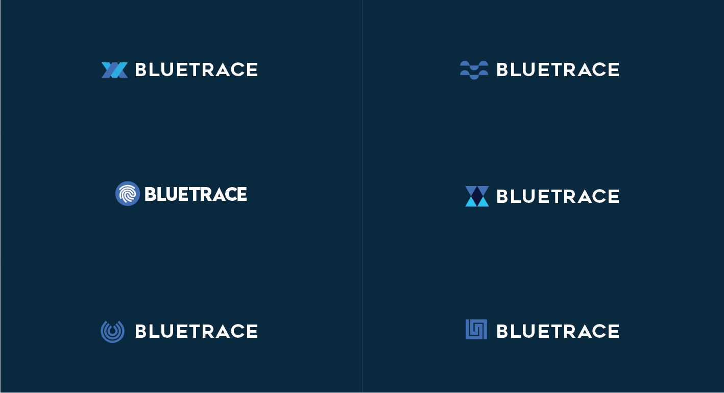
Creating the BlueTrace Logo
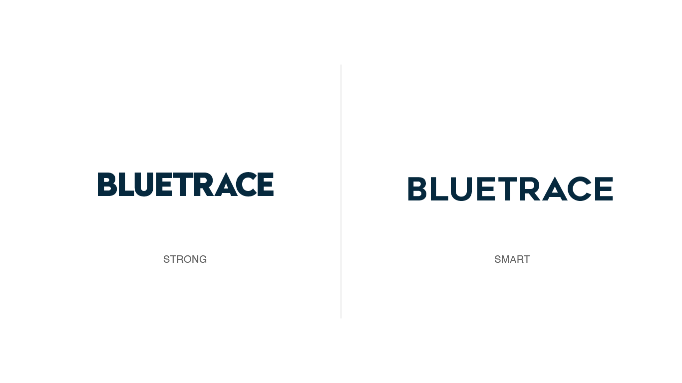
Once we had the name, our focus shifted to shaping the brand identity. We defined the attributes we wanted the company to project—ultimately choosing a smart and bold presence over options like strong or rustic. To inspire our direction, we studied brand identities not just from seafood and tech companies, but from manufacturers of gear and equipment that seafood professionals rely on every day.
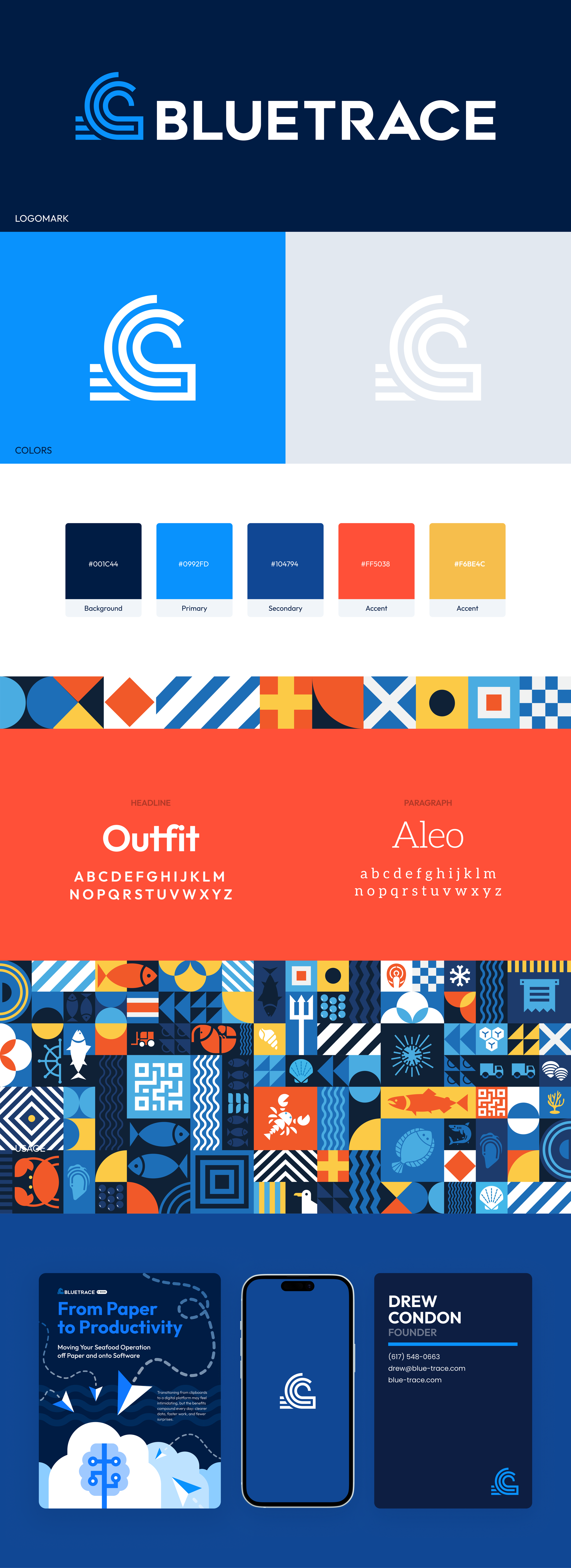
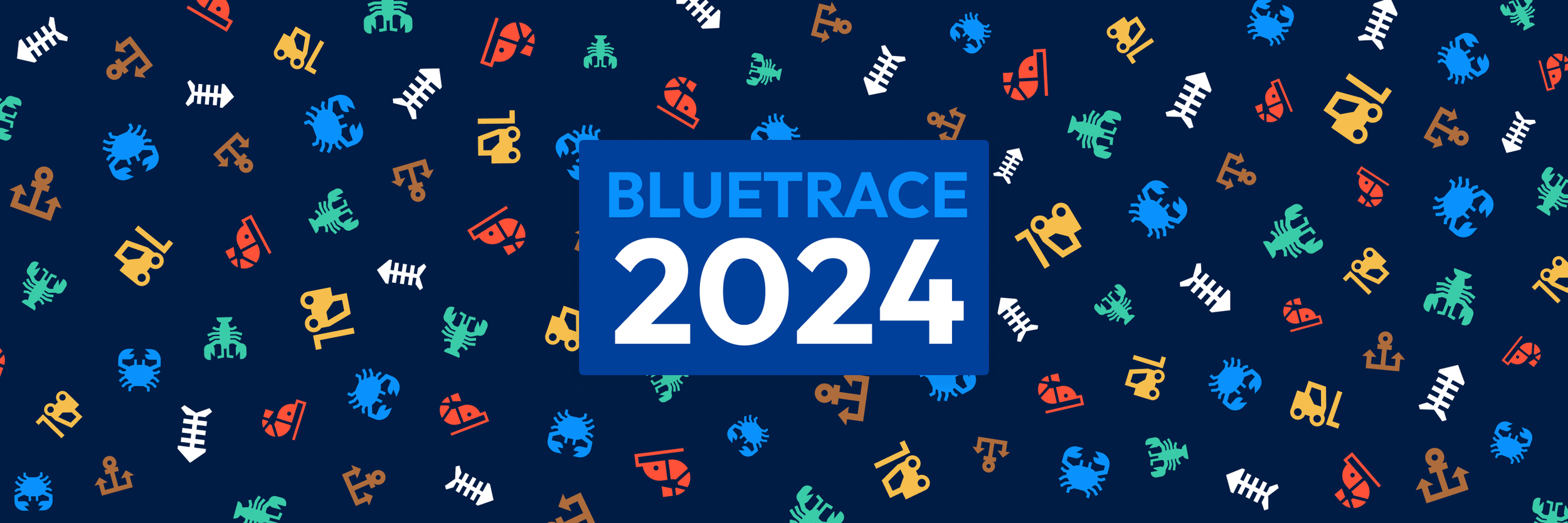
Through this process, we developed several concepts and, as a founding team, selected the one that resonated most: the BlueTrace Wave. Designed to echo both the ocean and a fingerprint, the mark symbolizes movement, traceability, and the industry we serve. With the wave as our foundation, we established our color system—anchored, fittingly, in blue—to carry the identity forward.


V1: Beta Identity
With a logo direction, brand adjectives, and a color foundation in place, we initially implemented a “proto-brand”—a lightweight identity that let us move quickly without over-investing too early. For the first year, as we launched the original BlueTrace product, that scrappy brand carried us.


V2: Brand Language
Once it was clear the company had momentum, we invested in building a true identity system. We explored multiple mood boards, testing different combinations of tone—strong and bold, laid-back and rustic, or high-tech and smart. We pulled inspiration from the seafood world, including nautical flags and industrial gear, and experimented with color systems that ranged from classic blues to bright reds, yellows, and fluorescent greens.
The result was a strong, nautically inspired brand system—anchored in bold colors and maritime references—that gave BlueTrace a distinct and confident visual identity.


V3: Polished Identity
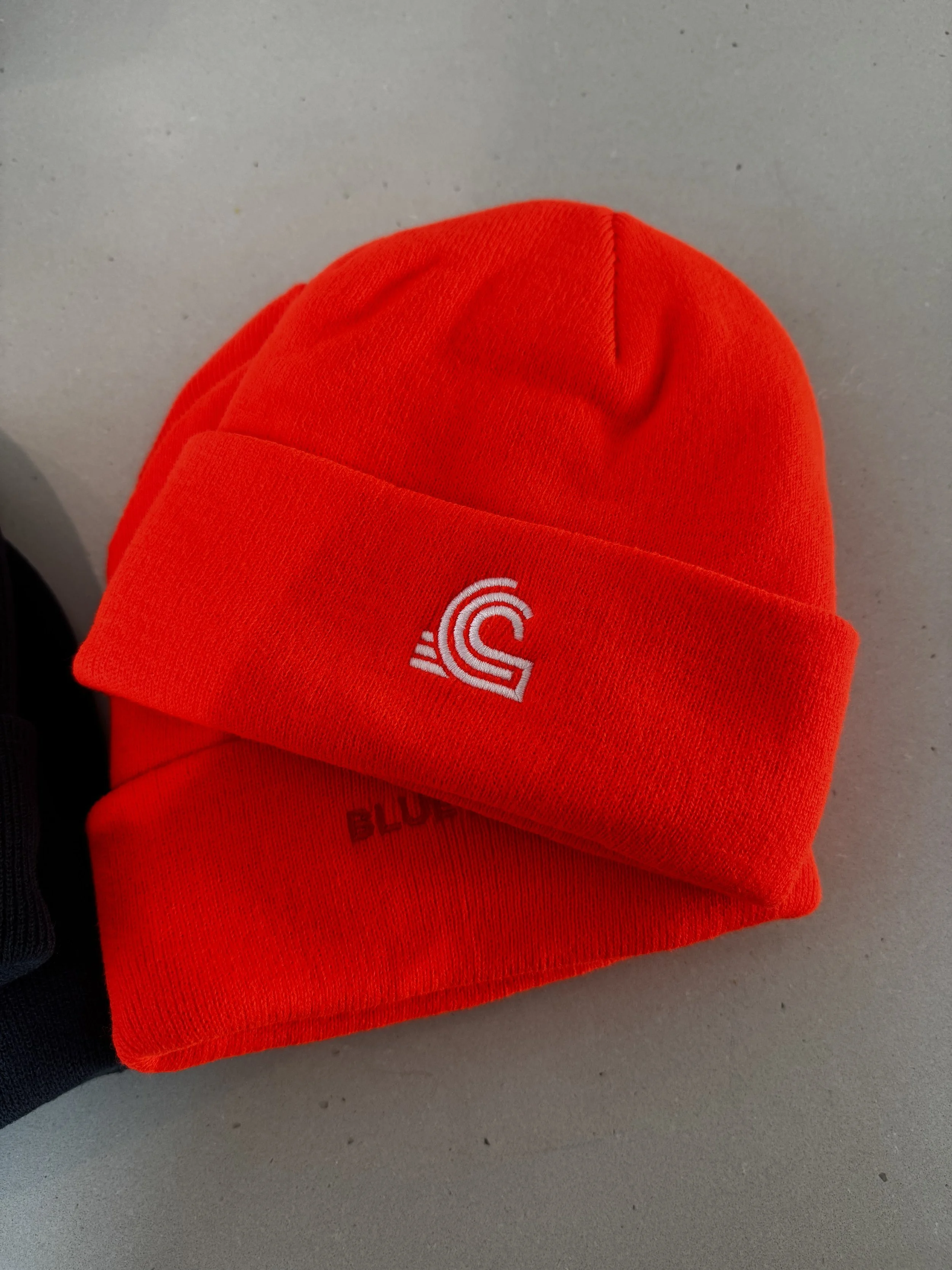
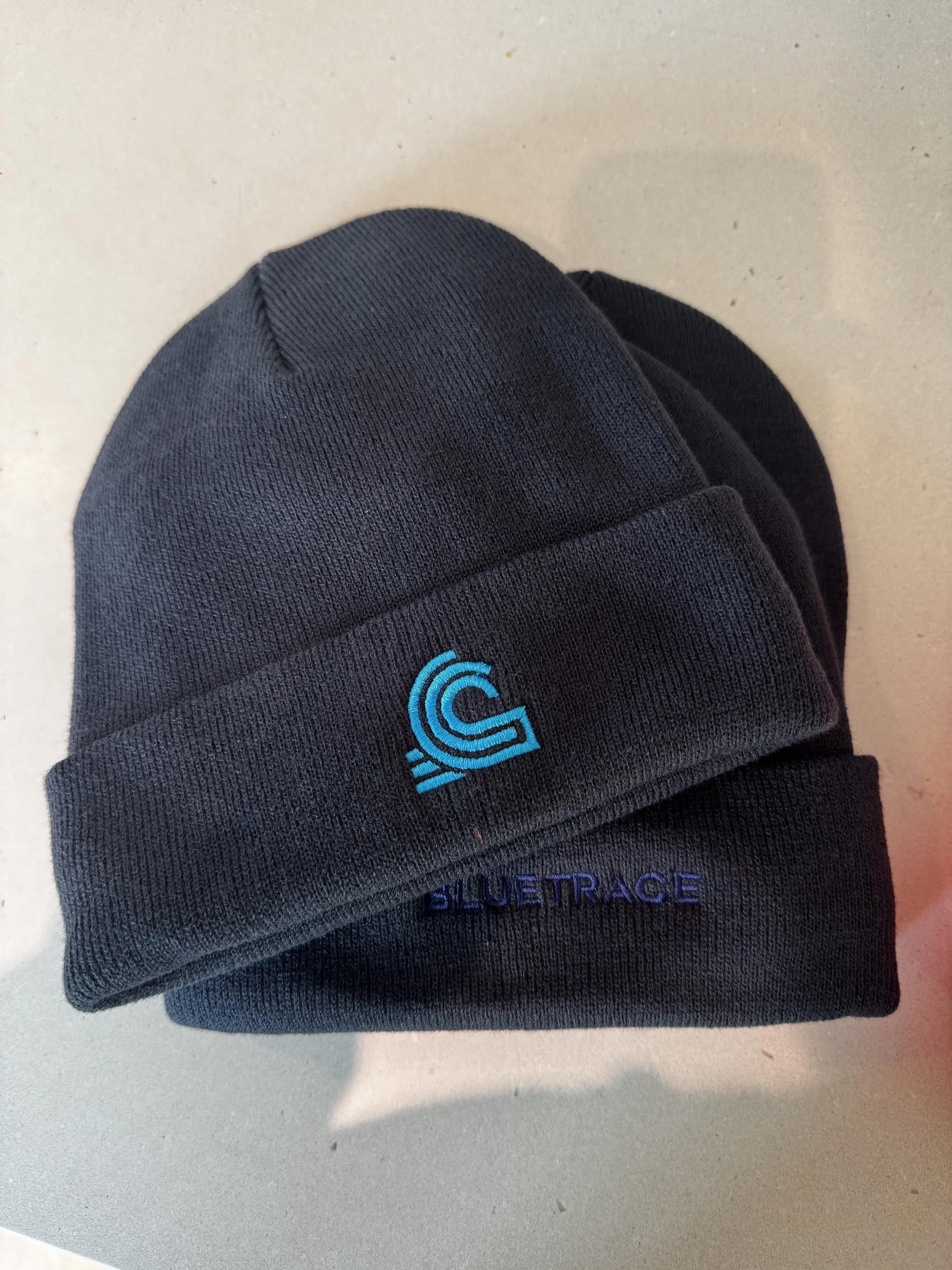
Once we had a brand direction we were confident in, the next step was turning it into a working style guide. We refined the color system—including light and dark palettes—selected headline and paragraph fonts, and began applying the identity to real-world items like hats, stickers, beer koozies, and even oyster knives.
We also explored patterns and abstract graphics to expand the visual language, then systematized everything into a Figma-based brand kit. This kit became the single source of truth for the team—providing assets, usage guidelines, and even “do not use” references to old logos. Our focus wasn’t on creating a monument to the brand, but on making a practical, living toolkit that empowered everyone to quickly create consistent, high-quality marketing materials.


Letting the brand loose in the wild
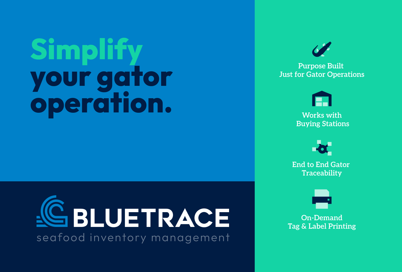
With the logo and visual language finalized, we brought the brand to life across real-world touchpoints. For our audience—seafood distributors who are difficult to reach through traditional digital channels—direct mail became a key strategy. We also leaned heavily on branded swag and giveaways, from hats and stickers to keychains and oyster knives, ensuring the BlueTrace identity showed up in the everyday lives of our customers.
Results
High BlueTrace brand recognition (we don’t have a number)
No confusion about what market we serve.
Stand out from pier companies, but not a “tech company”
People love our hats