HUBSPOT
Helping reporting product teams get unstuck by solving stubborn IA from a different direction.
Challenge
I was asked to tackle a rethinking of the information architecture for the HubSpot reporting suite—a part of the product that had struggled for years with ambiguity and fragmentation.
Customers often found the reporting IA confusing, duplicative, and scattered across the platform in ways that didn’t make sense.
My role was to bring structure and clarity to this messy ecosystem for the teams that owned it, creating an information architecture and vision for the design that made the relationships between reporting tools intuitive, consistent, and usable.
Goal
Solve the IA issue for good
Reduce the amount of duplicative reporting experiences across the HubSpot platform.
Unstick UX product teams that were spinning there wheels on increasingly small pieces of the reporting puzzle.
Constraints
IA vision needed to be implemented by product teams, not design architects
Assumed a multi year phased effort
Needed continued buy in from Product Group Lead to make it happen.
Process


UX Analysis Paralysis
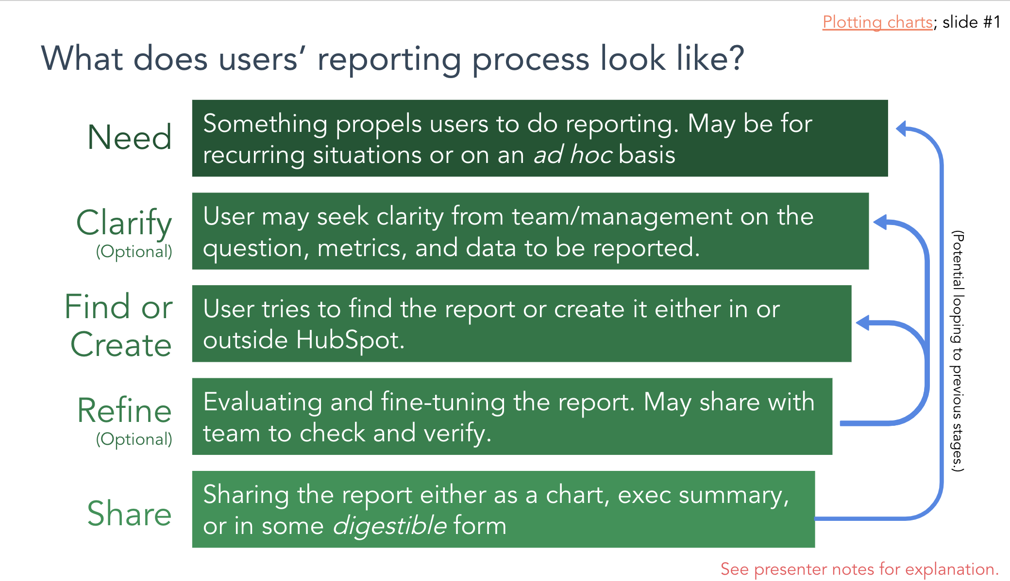
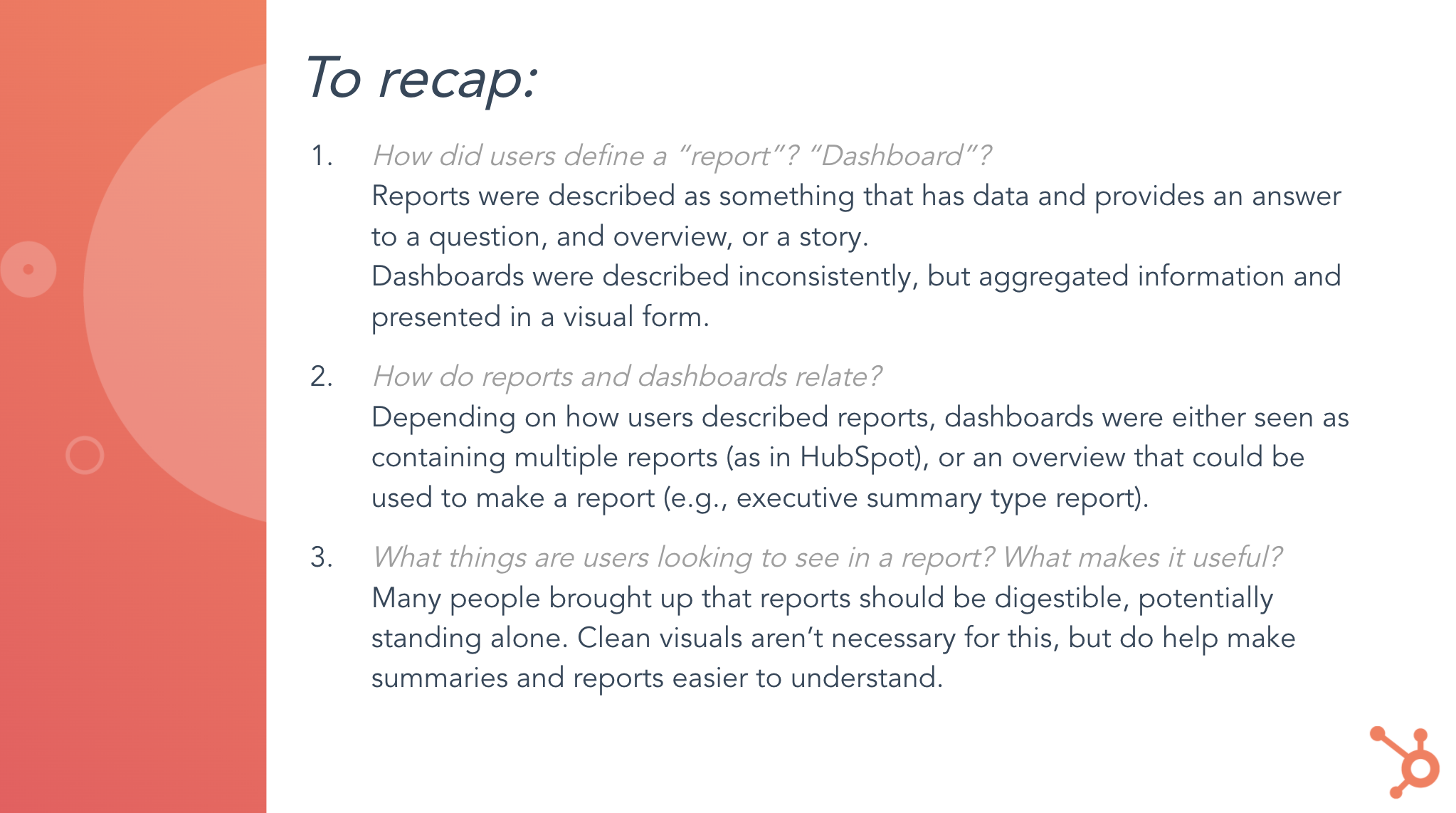
The first step I took on the reporting project was to gather all the existing research and customer feedback from the previous years. I expected it to provide some direction, but instead we found the analysis had been over-fragmented. Researchers had broken down the reporting problem into pieces so small or so generalized that they weren’t actionable or surprising. Customers had a good sense that things were wrong, but internally our UX team seemed to be over complicating the solution.
While that was disappointing, it did highlight some useful signals about where customers were struggling, which helped us target the next phases.


A IA/UX review of the market and our own tools.
To ground our work, we began with a broad competitive UX and IA review, studying the interfaces and information architecture of a wide range of reporting products. We looked at standalone BI tools, dashboard-centric apps, direct competitors like Salesforce and Zendesk, and specialized platforms like Google Analytics.
From this, we built a model of how reporting tools are typically organized and what core objects they emphasize. The patterns were surprisingly clear: there are only a few dominant models, and they were highly intuitive to us.
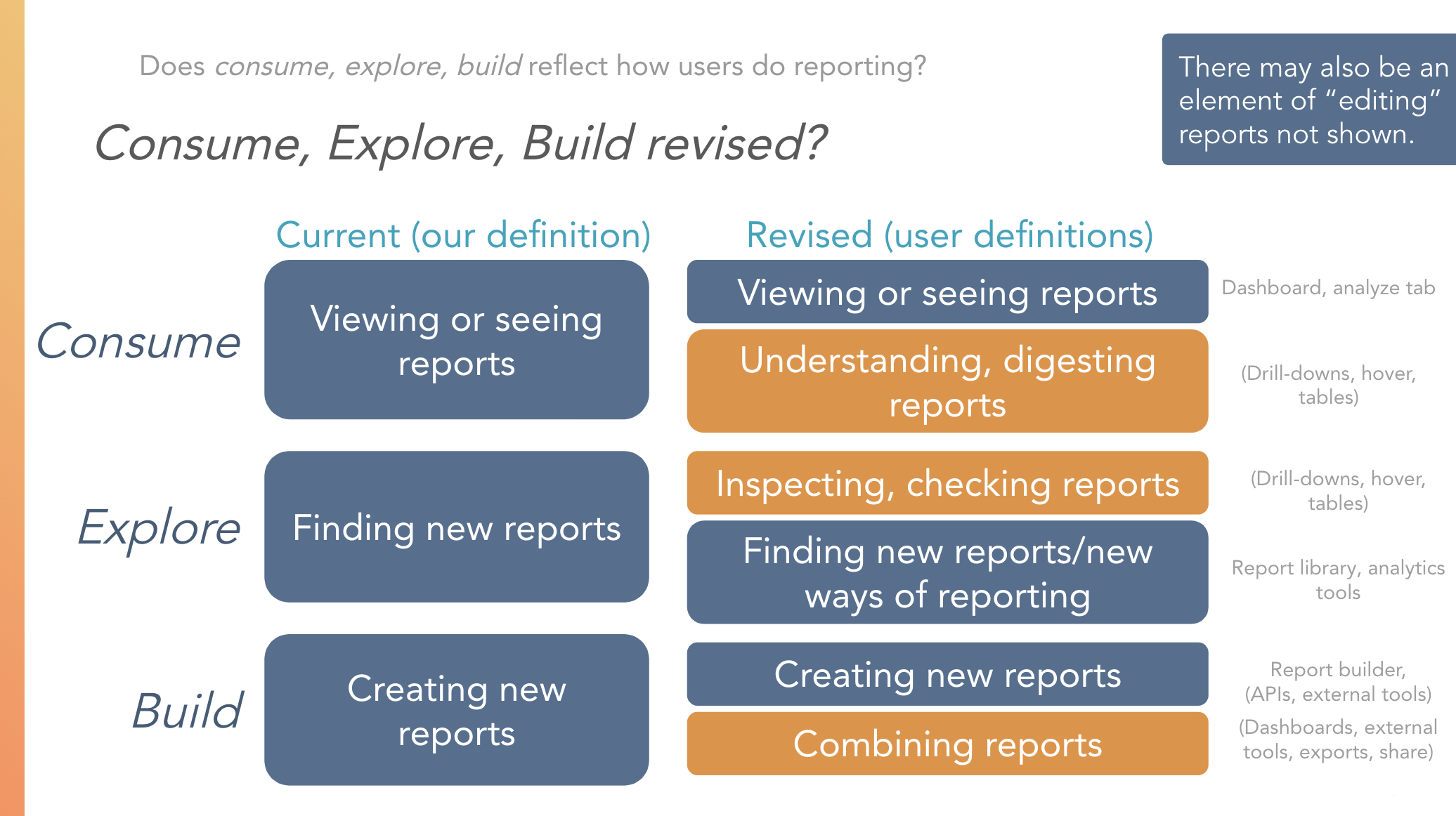
We also ran a full review of HubSpot’s reporting tools, organizing them by the types of tasks they supported—whether dashboarding and reporting, data exploration, or in-task decision support. What we discovered was that HubSpot already had many of these pieces, it just hadn’t assembled them in a way that made sense.
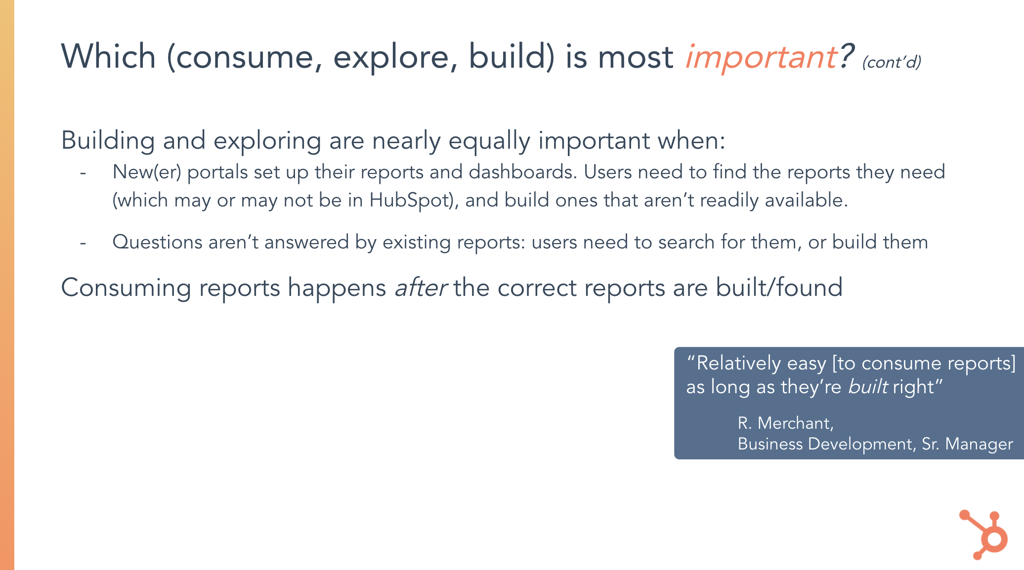
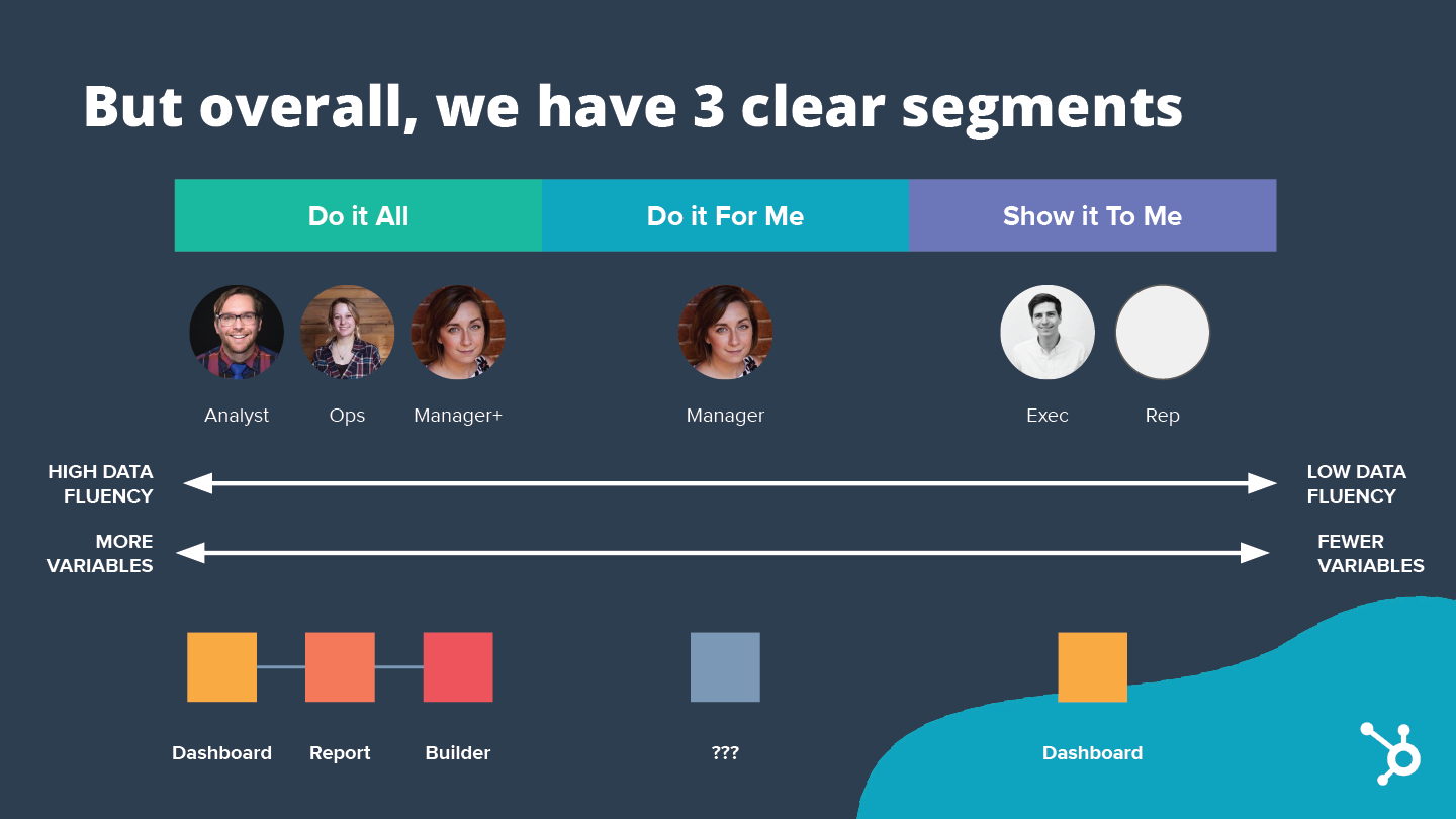
We mapped these parts against observed user behaviors, which generally fell into three groups: people who wanted a tool that could do everything, people who wanted it to do the work for them, and people who just wanted the insights shown clearly. From this analysis, we recommended that HubSpot invest in building an integrated BI-style reporting tool as the foundation.
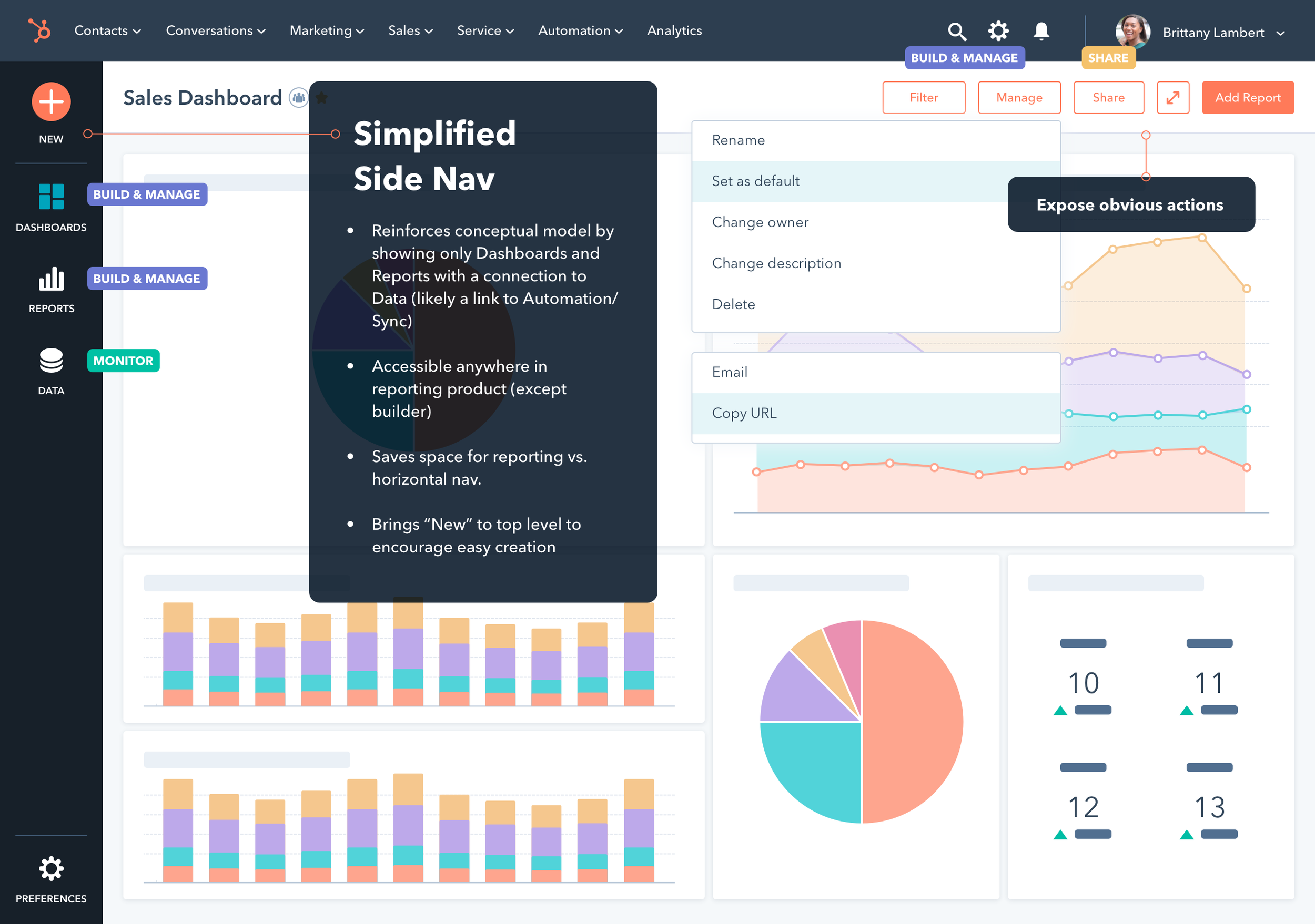

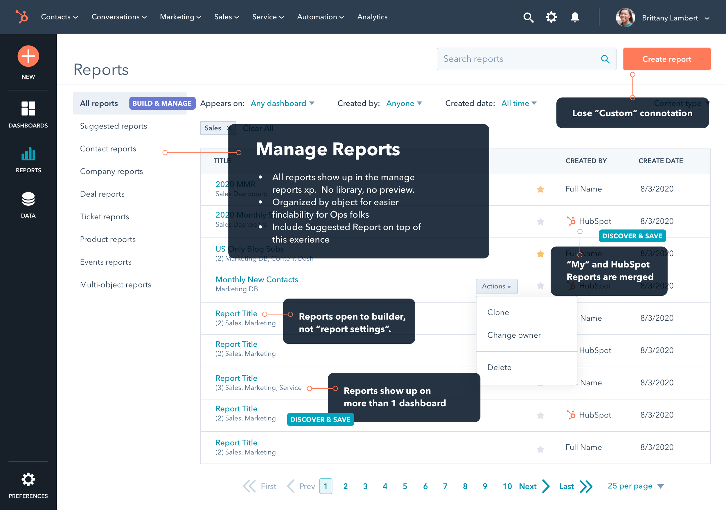

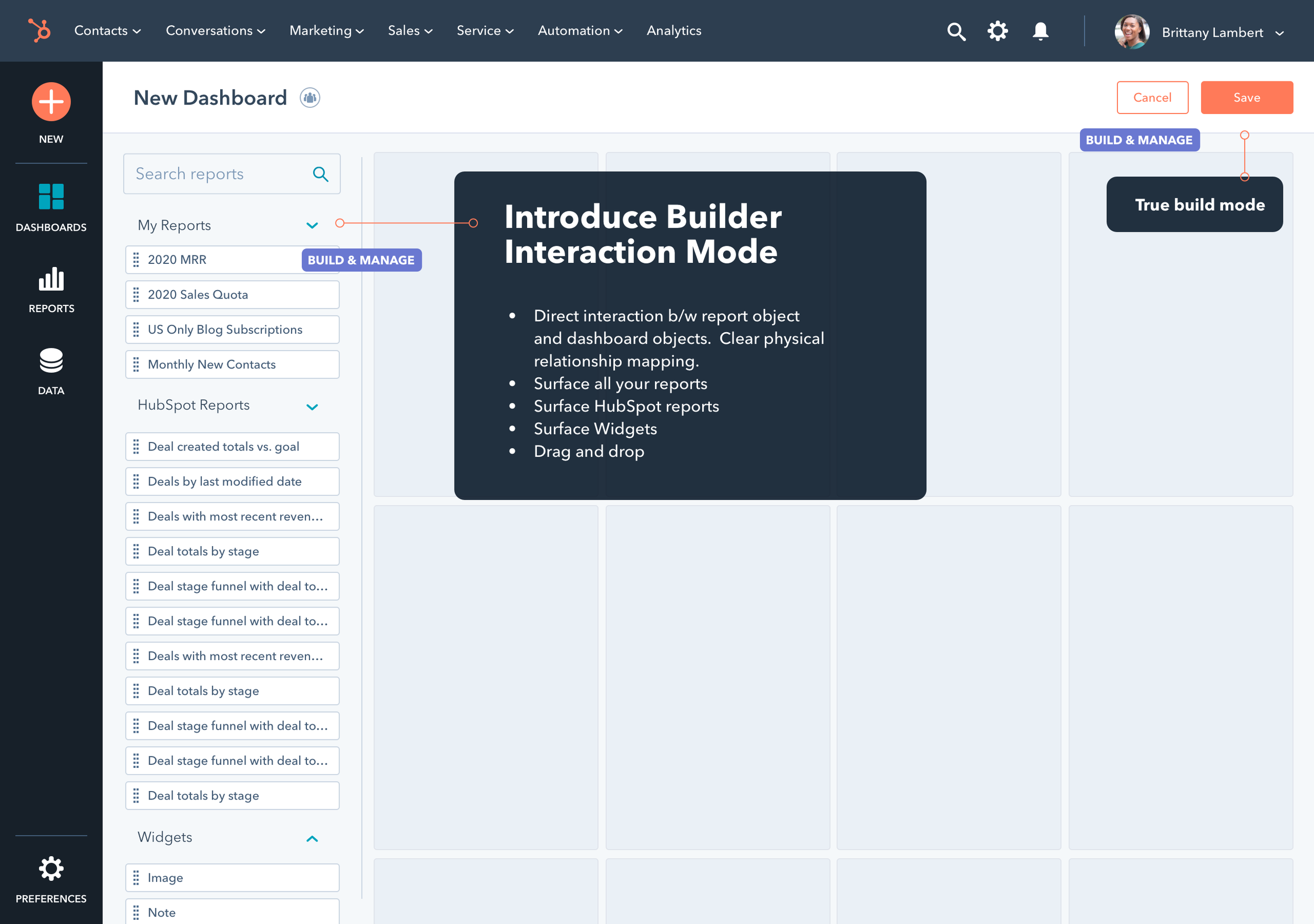
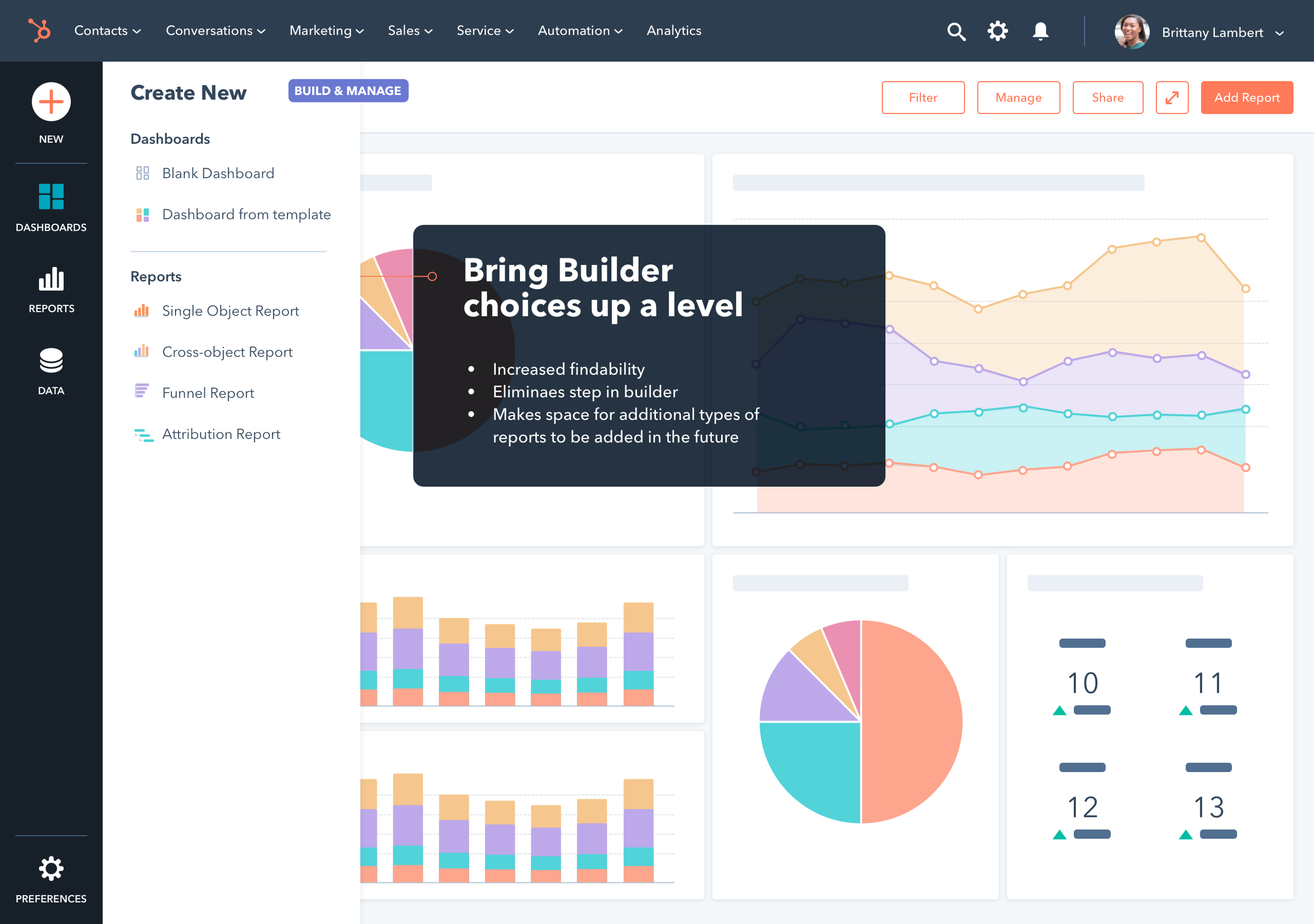
Prototype as Design Vision
With a clear strategy for the reporting information architecture, we built a prototype to bring the vision to life. The goal wasn’t to finalize UI details, but to show product managers, designers, and researchers how HubSpot’s many fragmented reporting experiences could be recombined into a coherent model.
Some elements stayed as they were, others were moved, and some were removed entirely. The prototype served as a tangible vision—aligning and inspiring the team around a future that not only reflected competitive best practices but also directly addressed the pain points we heard from users.
Results
Reporting teams embraced the IA vision
Reporting teams embarked on a multi year journey to make it happen,
The new IA launched in 2024